07. Pie Charts
L3 071 Pie Charts V3
Pie Charts
A pie chart is a common univariate plot type that is used to depict relative frequencies for levels of a categorical variable. Frequencies in a pie chart are depicted as wedges drawn on a circle: the larger the angle or area, the more common the categorical value taken. Use a Pie chart only when the number of categories is less, and you'd like to see the proportion of each category on a chart.
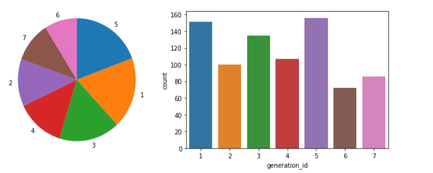
Pie chart (left) and bar chart (right) displaying the same categorical counts, 'generation_id' in the pokemon dataset.
Unfortunately, pie charts are a fairly limited plot type in the range of scenarios where they can be used, and it is easy for chart makers to try and spice up pie charts in a way that makes them more difficult to read.
Guidelines to Use a Pie Chart
If you want to use a pie chart, try to follow certain guidelines:
- Make sure that your interest is in relative frequencies. Areas should represent parts of a whole, rather than measurements on a second variable (unless that second variable can logically be summed up into some whole).
- Limit the number of slices plotted. A pie chart works best with two or three slices, though it's also possible to plot with four or five slices as long as the wedge sizes can be distinguished. If you have a lot of categories, or categories that have small proportional representation, consider grouping them together so that fewer wedges are plotted, or use an 'Other' category to handle them.
- Plot the data systematically. One typical method of plotting a pie chart is to start from the top of the circle, then plot each categorical level clockwise from most frequent to least frequent. If you have three categories and are interested in the comparison of two of them, a common plotting method is to place the two categories of interest on either side of the 12 o'clock direction, with the third category filling in the remaining space at the bottom.
If these guidelines cannot be met, then you should probably make use of a bar chart instead. A bar chart is a safer choice in general. The bar heights are more precisely interpreted than areas or angles, and a bar chart can be displayed more compactly than a pie chart. There's also more flexibility with a bar chart for plotting variables with a lot of levels, like plotting the bars horizontally.
Plot a Pie Chart
matplotlib.pyplot.pie()
You can create a pie chart with matplotlib's matplotlib.pyplot.pie() function. A basic syntax is:
matplotlib.pyplot.pie(x_data, labels, colors, startangle, counterclock, wedgeprops)
This function requires that the data be in a summarized form: the primary argument to the function will be the wedge sizes. Refer to the function syntax for details about all other arguments.
matplotlib.pyplot.axis()
We also need to know about the matplotlib.pyplot.axis() function to set some axis properties. It optionally accepts the axis limits in the form of xmin, xmax, ymin, ymax floats, and returns the updated values.
matplotlib.pyplot.axis(*args, emit=True, **kwargs)
In the function above, the *args represents any number of arguments that you can pass to the function, whereas **kwargs stands for keyword arguments, generally passed in the form of a dictionary.
Refer to the function syntax for in-depth details on the all possible values of the arguments.
Example 1. Plot a simple Pie chart
# Use the same pokemon dataset
sorted_counts = pokemon['generation_id'].value_counts()

plt.pie(sorted_counts, labels = sorted_counts.index, startangle = 90, counterclock = False);

# We have the used option `Square`.
# Though, you can use either one specified here - https://matplotlib.org/api/_as_gen/matplotlib.pyplot.axis.html?highlight=pyplot%20axis#matplotlib-pyplot-axis
plt.axis('square')
To follow the guidelines in the bullet points above, I include the "startangle = 90" and "counterclock = False" arguments to start the first slice at vertically upwards, and will plot the sorted counts in a clockwise fashion. The axis function call and 'square' argument makes it so that the scaling of the plot is equal on both the x- and y-axes. Without this call, the pie could end up looking oval-shaped, rather than a circle.
TO DO
Did you notice the various arguments in the plt.pie() function? Particularly, the labels = sorted_counts.index argument represents a list of strings serving as labels for each wedge. In the example above, the labels have used the following list:
sorted_counts.index
([5, 1, 3, 4, 2, 7, 6], dtype='int64')
Can you try using another list of strings, ['gen5', 'gen1', 'gen3', 'gen4', 'gen2', 'gen7', 'gen6'], to display labels on each wedge? Notice that the labels are arranged in the decreasing order of the frequency. The expected output is shown below.
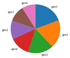
A bar chart with an updated label on each wedge.
Donut Plot
A sister plot to the pie chart is the donut plot. It's just like a pie chart, except that there's a hole in the center of the plot. Perceptually, there's not much difference between a donut plot and a pie chart, and donut plots should be used with the same guidelines as a pie chart. Aesthetics might be one of the reasons why you would choose one or the other. For instance, you might see statistics reported in the hole of a donut plot to better make use of available space.
To create a donut plot, you can add a wedgeprops argument to the pie function call. By default, the radius of the pie (circle) is 1; setting the wedges' width property to less than 1 removes coloring from the center of the circle.
Example 2. Plot a simple Donut plot
sorted_counts = pokemon['generation_id'].value_counts()

plt.pie(sorted_counts, labels = sorted_counts.index, startangle = 90,
        counterclock = False, wedgeprops = {'width' : 0.4});
plt.axis('square')
Recommended Read
Refer to the documentation: Wedge patches
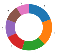
Donut plot representing the 'generation_id' in the pokemon dataset
Further Reading
- Eager Eyes: Understanding Pie Charts
- Eager Eyes: An Illustrated Tour of the Pie Chart Study Results - how accurately do people perceive different formulations of the pie chart?
- Datawrapper: What to Consider when Creating a Pie Chart